As a student, I remember learning that slab serifs used to be called Egyptians, back in the 1800s, but that there was nothing Egyptian about them. And sometimes sans serifs were also called Egyptians, except when they were called Antiques, which was also sometimes used to refer to slab serifs. What a mess!
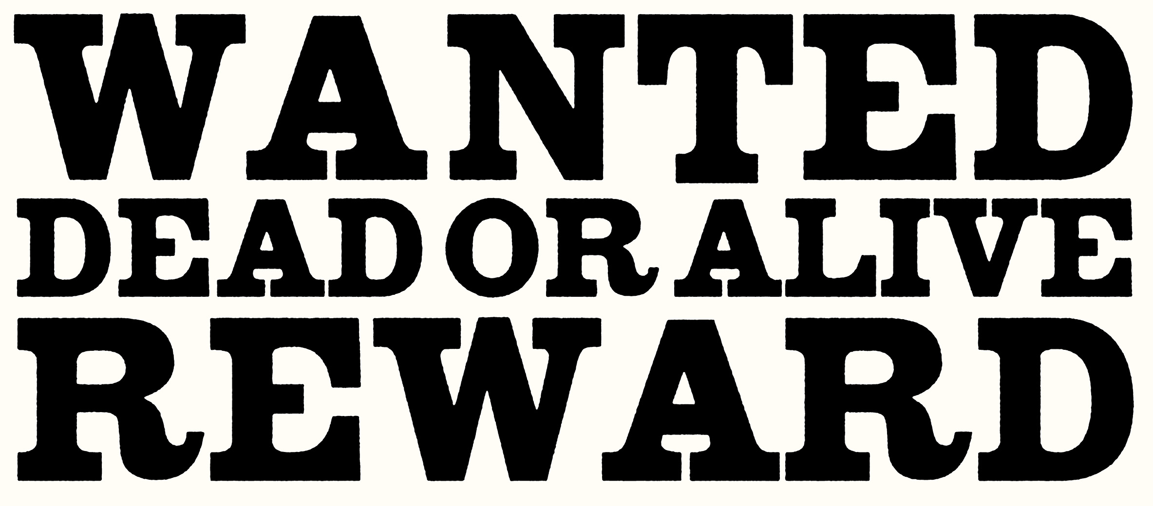
However, maybe this shouldn’t be a surprise if you consider the slab serif’s origins. In contrast to typefaces like Garamond or Baskerville, which were made for typesetting books, slab serifs were developed for the lowliest form of graphic design—advertising. They were manufactured cheaply, out of wood, for setting big dumb words on posters advertising narcotic-laced elixirs and bounties for the capture of dangerous criminals. These were not the kinds of typefaces a serious typographer gets involved with. At least, this is the message I received at the time.
Dispatch 1: A New Slab
I made the first drawings for Dispatch in the late 90s as a very junior type designer at Font Bureau. They were a minor part of a proposal for a palette of custom newspaper typefaces. I think part of the reason I got this chance was no one really expected a slab serif to get through the initial client reviews. Thankfully, they were right.
However, those rejected sketches fired up my imagination and I made it my mission to draw a new slab serif that didn’t look like something from the Old West. I wanted to draw a slab serif that felt at home in the year 2000, that belonged to the future, not the past.
With that in mind, Dispatch’s slab serifs are simple rectangular shapes. I drew them without any bracketing to emphasize their basic geometry. I also removed conventional typographic detail around the vertical serifs in glyphs like the C. I did add an extra vertical serif at the bottom of the C but I thought that made it look like a tool for tightening the bolts on a rocket ship.
However, the main difference between an old fashioned slab serif and Dispatch is in the white shapes. First the lengths of the serifs were adjusted to keep the gaps between them as consistent as possible. Second, the squarish curves result in letters with similar counterforms and more uniform widths. All this adds up to words and text with a more modern syncopated beat rather than the clunky (although often charming) irregular rhythm of a more traditional slab serif design.
Of course, not all slab serifs were the ones on wanted posters. There is City, a modernist design from Georg Trump, circa 1930. In 1967, the refined and practical Serifa was developed by Adrian Frutiger. More contemporary to Dispatch is Cholla, a very cool series from Sibylle Hagmann. These typefaces, as well as feedback from my co-workers, influenced this series.
Dispatch 2: The Revenge of the Serif
The original Dispatch is a big family with an extensive range of weights and widths, which makes it a great candidate to become a variable font. This font format didn’t exist when the design was originally developed, so we knew we would have to figure out how to adapt it.
The slab serifs made this complicated. In the original version, I manually removed some of the serifs in certain glyphs in the heavy and/or narrow styles to keep them from getting too close or colliding. For the variable font to work properly, any serif removal would have to be programmed into the font so it could happen automatically.
We knew this was possible, technically. However, the tools that existed for programming these kinds of changes were either unable to handle such complex families, or required extensive modification to work. Faced with trying to write multiple sets of cryptic substitution rules for dozens of different glyphs, I began to feel very pessimistic.
As a designer, sometimes technological limitations can be a great push to think creatively. Other times, knowing the headaches that await you in the near future will hamper your ambitions, consciously or not. In addition to being anxious about finishing Dispatch 2, I worried how this issue might negatively influence the direction of new typefaces designed for the variable font format.
Fortunately, Marie Otsuka and Nic Schumann understood the problem and developed a new tool for plotting multidimensional glyph substitutions. Thanks to its visual interface, I could essentially just look at the different weights and widths of Dispatch and point to the ones where I wanted the serifs removed. This freed me to design the typeface I had in mind without a technical nightmare looming over me.
Currently, the Variable Font Substitution Mapper is available as a free online tool to type designers everywhere. It works with typefaces of all kinds, not just slab serifs. We built it for our workflow and it still requires some command-line interaction. We know it’s not a perfect solution for all, however, the code is open source and we hope it can continue to evolve with collective effort. Marie and Nic explain more about it in this presentation at Typographics 2021.
Conclusion
When I look at Dispatch now, I see a really tightly-wound design. The curves are so tense, I’m surprised they don’t snap under all the pressure. In retrospect, that’s a pretty good reflection of my own state of mind when I drew them originally.
It was an interesting experience to revisit the series and be able fix some details that have been bothering me for at least a decade. I got rid of the diagonal cuts on the bottom of the seven and the top of the comma. I also made some big modifications like revising the width relationship between the uppercase and lowercase in the narrower versions. I resisted changing the overall character of the design though. It’s still Dispatch.
We also added some new features that various users have requested over the years. For example, there are alternate quotation marks drawn in the traditional inverted style. There are simplified versions of the a, g, and u. And a feature for creating nut fractions.
I’m grateful for Cem Eskinazi’s energy and hard work during our collaboration on version two of Dispatch as well as Stainless. There is finally support for eastern and central European languages, Greek and Cyrillic, as well as corresponding italics. Maybe in another 20 years, we will release version 3.
Visit this minisite by Tiger Dingsun to see Dispatch 2 and Stainless 2 in action featuring a sonic collaboration between Tiger and Cyrus. Like all Occupant Fonts releases, Dispatch 2 is available for print, web, applications, and ePub licensing on Type Network. Webfonts may be tested free for thirty days.